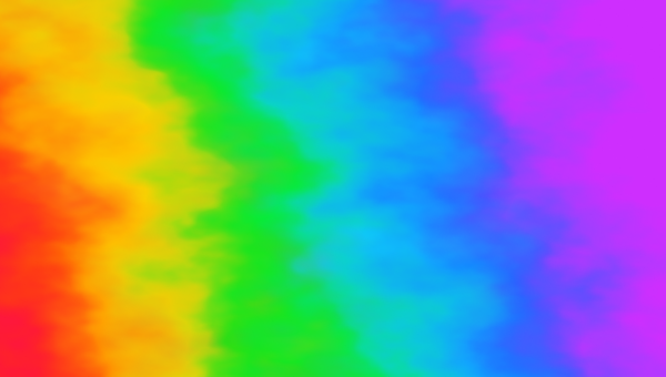
What is a CSS gradient?
A CSS gradient is a smooth color transition rendered natively by the browser as a background image. Because it's drawn by the engine instead of loaded from disk, a gradient is infinitely scalable, has zero network cost, and animates cheaply. The CSS specification defines three official gradient functions: linear-gradient(), radial-gradient(), and conic-gradient(). Each is set as a value of background-image (or any property that accepts an image), and each can be combined with the others by stacking them in a comma-separated list.
Gradients are not images. You can't resize them with width or heightthe way you would a JPEG, and they don't carry alt text. Search engines treat them as decoration. That makes them perfect for hero backgrounds, button surfaces, divider lines, and anywhere you'd otherwise reach for a flat color but want a touch more depth. The trade-off is small: gradients can't be inspected or downloaded by users the way an image can, but for visual styling, that's exactly what you want.
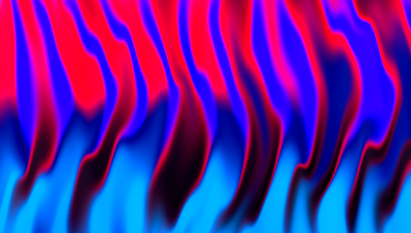
Linear gradients (linear-gradient)
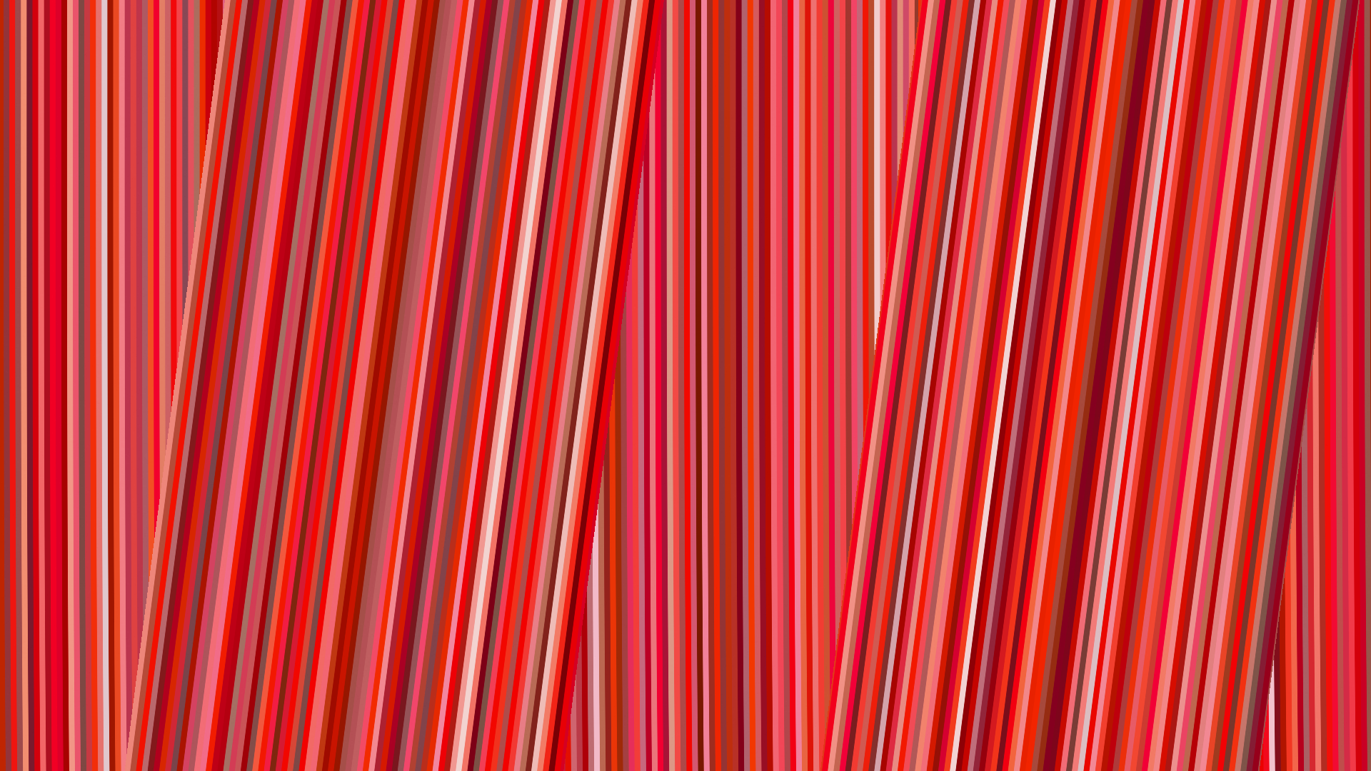
A linear gradient flows in a straight line from one color to another. Direction is controlled by an angle in degrees (0deg points up, 90deg points right, 180deg points down) or by a keyword like to right or to bottom right. The minimum syntax is two color stops:
background: linear-gradient(135deg, #FF512F 0%, #DD2476 100%);You can add as many stops as you need. Each stop is a color followed by an optional position (a percentage or length). When you omit positions, the browser distributes stops evenly. A useful trick: place two stops at the same percentage to create a hard edge — that's how stripes and split backgrounds are made without an SVG.
background: linear-gradient(90deg, #4FACFE 50%, #00F2FE 50%);For backgrounds and banners, linear-gradient(135deg, ...) is the most-used direction because diagonal flows feel more dynamic than vertical or horizontal ones. Vertical (180deg) is best for fade-to-bottom hero overlays where you want to keep text legible against a photo. Horizontal (90deg) is the go-to for progress bars, sliders, and divider lines.
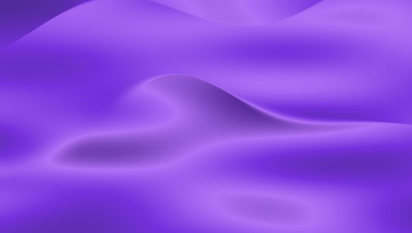
Radial gradients (radial-gradient)
A radial gradient radiates outward from a single point. The shape can be a circle or an ellipse, sized to a keyword (closest-side, farthest-corner) or to explicit dimensions, and positioned anywhere with the at keyword. The most common form keeps the gradient circular and centered:
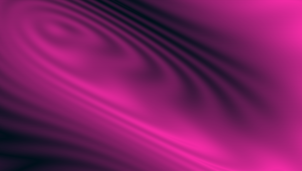
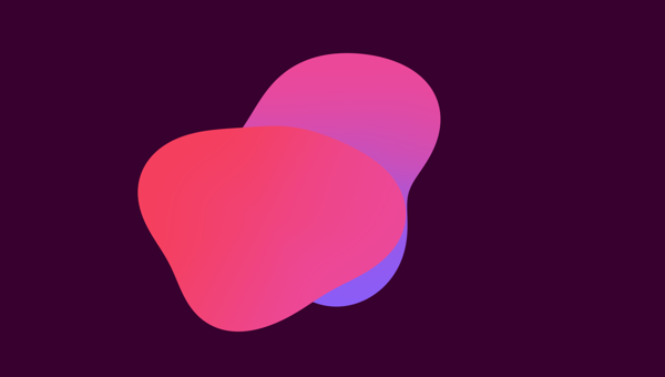
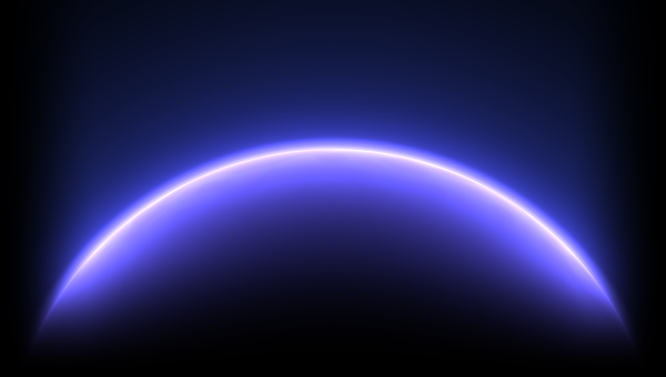
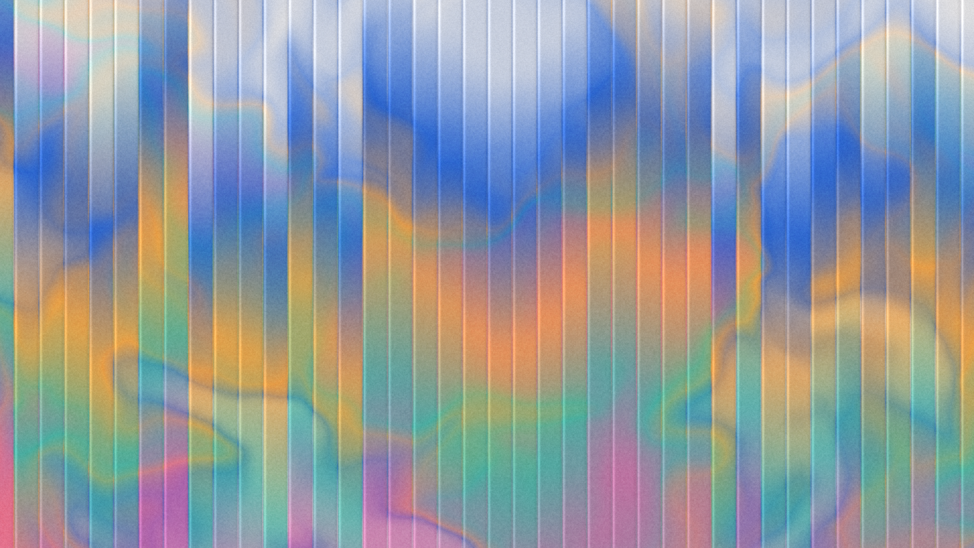
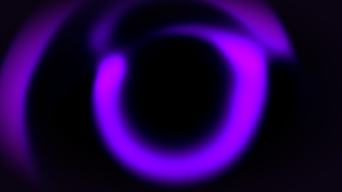
background: radial-gradient(circle at 50% 50%, #FF6CAB 0%, #7366FF 100%);Radial gradients are perfect for spotlights, vignettes, and soft glows. Off-center the gradient with at 30% 100% and you get a sunrise-style glow rising from the bottom-left. Stretch it into an ellipse for wide horizon effects. They also stack beautifully — put a radial highlight on top of a linear base for the glassmorphism look used in modern dashboard UI.
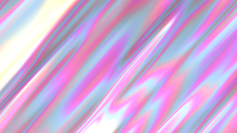
Conic gradients (conic-gradient)
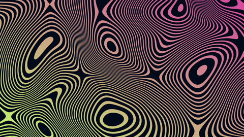
Conic gradients are the newest of the three. Colors sweep around a center point in a circle, the way a clock hand moves. They're what you reach for when you need a pie chart, a color wheel, an iridescent foil shimmer, or an angle-based highlight. The starting angle is controlled with from, and the center with at:
background: conic-gradient(from 180deg at 50% 50%, #FF6CAB, #7366FF, #43E97B, #FFE259, #FF6CAB);Note that the last stop matches the first — that's how you avoid a hard seam where the sweep wraps around. Conic gradients ship in every browser released since 2020, but if you need to support older Safari or Edge, fall back to a static SVG or a plain linear-gradient.
Transparency and alpha gradients
Every color stop accepts alpha. The simplest way is the modern 8-digit hex (#RRGGBBAA) where the last two digits are the opacity, but you can also use rgba() or hsla() with explicit alpha. A gradient that fades into transparency is the foundation of overlay effects: a dark linear-gradient on top of a hero image keeps headline text legible, and a soft radial-gradient inside a card creates a glass surface.
background:
  linear-gradient(180deg, rgba(0,0,0,0) 0%, rgba(0,0,0,0.7) 100%),
  url('/photo.jpg') center/cover;
Layering works because background-image accepts a comma-separated list of images. The first image in the list paints on top. To get a clean fade, animate the alpha channel rather than the color — your eye is much more sensitive to opacity changes than to hue shifts, and animated alpha gradients render at 60 fps even on cheap hardware.
Animating CSS gradients
Native CSS can't animate background-image directly because the engine doesn't interpolate between two gradient strings. The two reliable workarounds are: animate background-position on a long gradient and let the viewport scroll across it, or animate registered @property custom properties that feed into the gradient.
@property --c1 { syntax: '<color>'; inherits: false; initial-value: #FF512F; }
@property --c2 { syntax: '<color>'; inherits: false; initial-value: #DD2476; }
.hero {
background: linear-gradient(135deg, var(--c1), var(--c2));
animation: shift 6s ease-in-out infinite alternate;
}
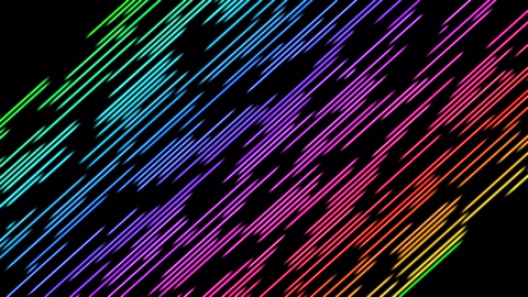
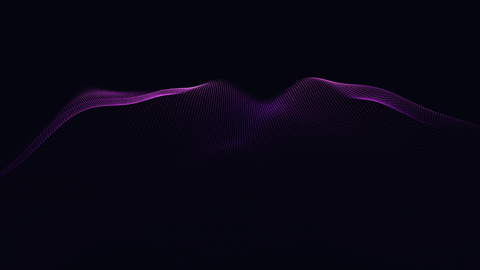
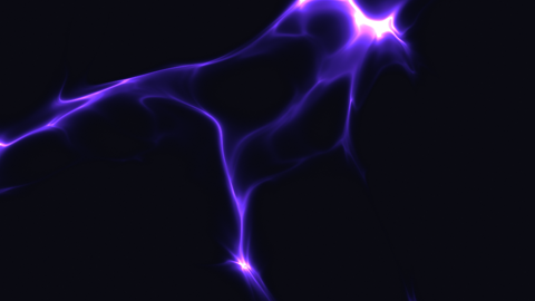
@keyframes shift { to { --c1: #4FACFE; --c2: #00F2FE; } }For more advanced animation — mesh gradients, holographic sheen, fluid metaballs, animated particle fields — you'll quickly outgrow what CSS can do alone. Those are the cases an animated gradient generator that exports as MP4 or React component is worth using; ours covers all of them in Studio.
Browser support
linear-gradient() and radial-gradient() have been universally supported since 2012 in every modern browser, including all current versions of Chrome, Firefox, Safari, and Edge. conic-gradient() shipped in Chrome 69 (2018), Firefox 83 (2020), and Safari 12.1 (2019); coverage is now ~98% globally per caniuse. The only place you'll hit issues is IE11 and very old Android WebView — for those, our Max Compatibility toggle adds -webkit-, -moz-, -o-, and -ms- prefixed versions.
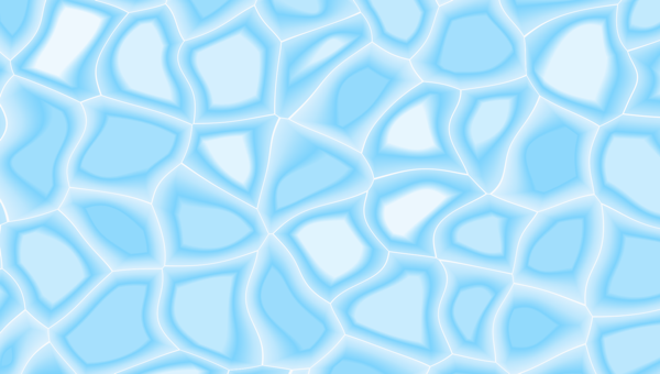
Common gradient patterns
A few patterns turn up in production CSS over and over. Memorise these and you'll cover 80% of real-world use:
- Hero overlay: a vertical
linear-gradient(180deg, transparent, rgba(0,0,0,0.6))on top of a photo so headline text stays legible. - Button surface: a subtle 135° two-stop gradient that lifts a flat brand color into something with depth.
- Glassmorphism: a low-alpha linear gradient inside a frosted card, paired with
backdrop-filter: blur(). - Gradient text: apply
background-clip: textwithcolor: transparentto make headlines paint with a gradient instead of a solid colour. - Skeleton loaders: a tall
linear-gradient(90deg, ...)with a movingbackground-positioncreates the shimmer effect ubiquitous in loading states. - Mesh-style backgrounds: stack three or four oversized
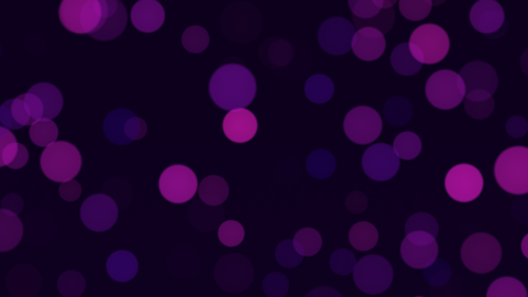
radial-gradient()s at different positions and let them blend through each other.
Accessibility considerations
Gradients can quietly tank contrast. Always test text colours against the darkest point of a gradient background, not the lightest. The WebAIM contrast checker only takes a single colour, so when in doubt, sample the gradient in DevTools at the spot where text actually sits. For animated gradients, respect prefers-reduced-motion: reduce; users with vestibular disorders can experience real discomfort from continuously shifting backgrounds.
Performance
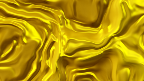
Static gradients are essentially free — a single linear-gradient compiles to a few GPU instructions and adds nothing measurable to paint time. Where you can hit perf walls is animating large gradient backgrounds, especially on mobile. Two rules: animate transform and opacity instead of background-imagewherever possible, and keep animated gradient backgrounds off elements larger than the viewport. If you genuinely need a full-screen animated mesh gradient, pre-render it to a 4-second loop MP4 — the browser's video decoder is faster than its CSS animation pipeline at that scale, and a 1080p loop weighs less than 200 KB.
Copy-paste CSS gradient code
Use the generator at the top of this page for an interactive build, or browse the example gallery below for ready-made snippets. Each gallery card has a single Copy CSS button that puts the full background: linear-gradient(...) declaration on your clipboard. Paste it into any element's style block — works in vanilla CSS, in Tailwind's arbitrary value syntax (bg-[linear-gradient(...)]), in CSS-in-JS, in React style props, in SwiftUI's LinearGradient with minor reshaping, and in Figma. Gradient code is portable; the same hex stops render identically everywhere.

